User Interface Design
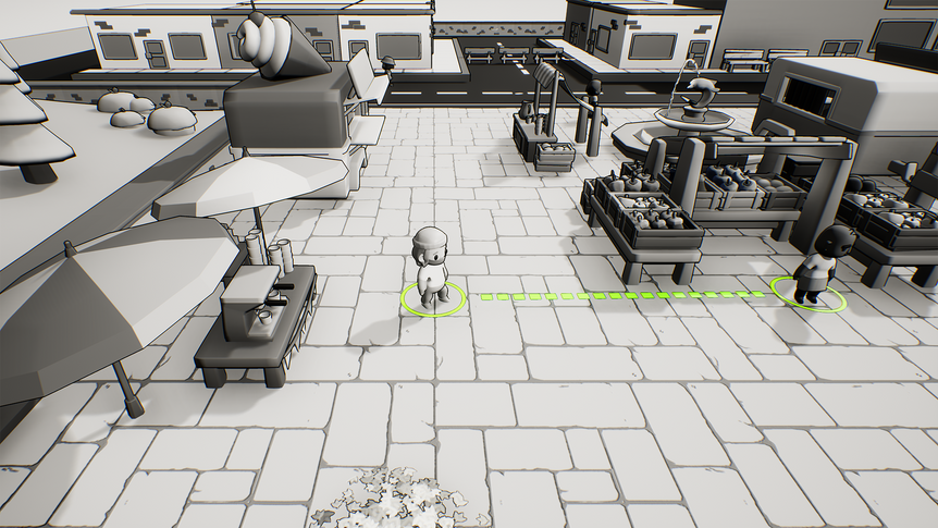
Designing the UI for this game was challenging. We wanted something minimal to match the black and white aesthetic but modern enough that it felt like it fit a game made in 2022. We wanted fonts that fit the comic book style created by our shader but were still highly legible. We wanted to display a lot of information, but in a clean way that didn’t obscure too much of the screen. I researched a number of styles and options before settling on glass morphism. I liked its sleek, minimalist feel and thought that would match the tone of our game well. Using color so sparingly also made it easier to highlight the information we really wanted players to pay attention to. To make the UI feel like it did not take up as much space as it actually did, I experimented with various levels of transparency and blur (the timer is darker in the final mockup because we couldn't add Unreal's blur effect to non-rectangular shapes). I created the graphics in Illustrator but then mocked up the functionality in Adobe XD, so it was easy to demonstrate my ideas to the team and iterate quickly before actually implementing anything. It took several rounds of revisions (not all pictured here), especially on the main UI elements like the happiness and risk meters, but I'm happy with how it turned out. Of course, the HUD was not the only UI I had to create, I just wanted to illustrate my iterative workflow. I also made the start menu, pause menu, COVID FAQ, settings menu, and end of day UI. I also implemented, animated, and created all the logic for each of those interfaces. The end of day UI was by far the most difficult because of the sheer amount of logic I had to add using Unreal’s Blueprint system to dynamically change what text, buttons, and animations display based on all the possible outcomes (see gameplay video).

